
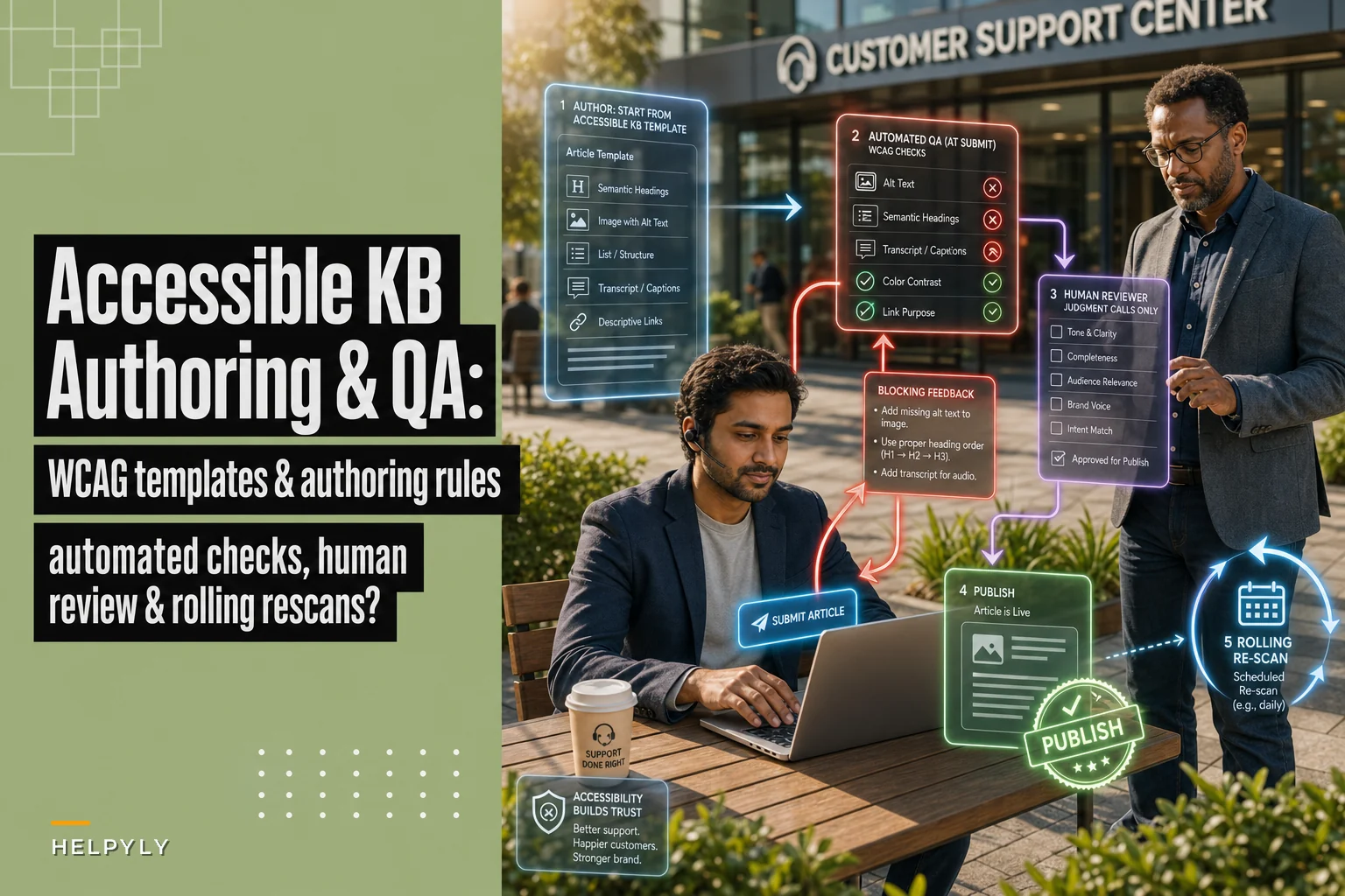

Most support teams don't find out their knowledge base is inaccessible until something forces the issue. A customer complaint. A procurement checklist from a big enterprise buyer. A legal email with the words "ADA" and "demand letter" in the same sentence. Suddenly someone has to answer the question: are our help articles actually usable by people relying on screen readers, keyboard navigation, or captions?
For most teams, the honest answer is no. Not because anyone decided to exclude anyone — but because accessibility was never baked into how articles get written. It got bolted on later, badly, under pressure.
This post is about doing it the other way around. Making accessible KB authoring a default behavior of your writing process, with templates and automated checks that catch problems before publish, plus a sane way to remediate the hundreds of old articles already sitting in your help center.
Why accessible KB content breaks (and it's almost never malice)
The failure pattern is boringly consistent. A support writer is fast, knows the product cold, and is measured on how many articles they ship and whether those articles deflect tickets. Nobody on that scorecard is measuring whether the screenshot has alt text or whether the heading structure actually nests correctly.
So what happens in practice:
-
Someone pastes a screenshot of the billing screen with the filename
Screenshot 2024-11-03 at 4.52.18 PM.pngas the alt text. That's what the editor auto-filled. Nobody changed it. -
Headings get picked for how big they look, not for what they mean. An article has an H4 followed by an H2 followed by three H3s because the writer liked the sizing.
-
A "watch this walkthrough" video goes up with no transcript and no captions.
-
Tables get used for layout instead of data, so a screen reader announces a navigational mess.
None of this is intentional. It's the predictable output of a process that rewards speed and never defined what "done" means for accessibility. If your definition of a finished article is "it reads well and answers the question," you will produce inaccessible content at scale, forever.
The search angle makes this worse in a sneaky way. A lot of the same structural decisions that help assistive tech also help ranking — clean semantic headings, descriptive text, real transcripts crawlers can index. When those are missing, you're losing both accessibility and discoverability. If you've already worked on structuring KB articles for search-first discovery, you've done half of this job without realizing it. Accessibility is the other half, and the two overlap more than most people expect.
What it actually costs when you ignore it
The costs land in three buckets, and they don't arrive at the same time.
Never let a customer request slip through the cracks.
Helpyly helps you track, resolve, and optimize every support interaction effortlessly.
- Centralized ticket management
- Automated customer notifications
- Performance analytics dashboard
No credit card required
The first is quiet and ongoing: customers who can't use your content just file tickets instead. Someone running a screen reader hits a how-to article where every step references "click the button shown above" with no described image, gives up, and contacts support. You never see why they contacted you — you just see a deflection rate that's lower than it should be and can never figure out why. This cost hides inside normal ticket volume, so nobody attributes it correctly.
The second is procurement. Enterprise and public-sector buyers increasingly send a VPAT (Voluntary Product Accessibility Template) request or ask you to attest to WCAG 2.1 AA conformance. Your help center is part of what they're evaluating. A team that can't credibly answer "yes, our documentation is accessible" can stall or lose a deal over it. This cost is lumpy and large.
The third is legal, and it's the one that gets budget approved fast. Web accessibility complaints have been a steady source of demand letters for years, and a public-facing knowledge base is squarely in scope. The remediation-under-duress version of this work costs far more than building it in from the start — you end up paying consultants to audit hundreds of articles on a deadline.
The first cost is the biggest in aggregate and the one you'll ignore the longest, because it never shows up labeled as an accessibility problem.
The authoring template: make the right thing the easy thing
The core move is to stop treating accessibility as a review step and make it part of the template writers start from. If the empty article they open already has the structure and the prompts built in, compliance stops depending on anyone remembering anything.
A practical accessible KB authoring template has these built-in constraints:
Heading structure is pre-scaffolded. The template ships with a single H1 (the title), and section placeholders start at H2. Writers fill in sections; they don't choose heading levels based on visual size. If the article needs sub-points, those nest as H3 under an H2 — never skipping levels. The rule the team enforces: heading level reflects document outline, not font size.
Every image placeholder forces an alt-text decision. Instead of a bare image upload, the template has an image block that won't let you save without choosing one of three paths:
-
Descriptive alt text (for images that carry meaning — a diagram, a screenshot showing where something is)
-
A short functional description plus the real info written out in the body text
-
Marked decorative (empty alt) for images that add nothing informational, like a divider graphic
The decision itself is the point. The worst alt text isn't bad alt text — it's the auto-filled filename nobody looked at.
Video and audio blocks require a transcript field. You can't publish the article with an empty transcript attached to a media embed. Captions handle the in-video experience; the transcript handles indexing and users who'd rather read.
Tables are for data only. The template gives writers a proper data-table block with header cells marked as headers. Layout gets handled by the template's own structure — there's no "table for layout" option to reach for.
Force the alt-text decision at image upload so the writer makes it while the context is fresh.
Alt-text rules writers can actually follow
Alt text is where most teams flail, usually by overthinking it. A short rule set beats a philosophy lecture:
-
Describe the purpose of the image in context, not every pixel. For a screenshot showing where the "Export" button lives, good alt text is "Settings page with the Export button highlighted in the top-right toolbar" — not a paragraph describing the entire UI.
-
If the image shows a value or state the reader needs (an error message, a specific setting), put that information in the body text too. Don't trap critical information inside an image.
-
Decorative images get empty alt (
alt=""), not a description. Announcing a decorative swoosh to a screen reader user is noise, and noise is its own accessibility failure. -
Keep it under roughly 125 characters. If you need more than that, the information belongs in the text.
The mistake teams make here is writing too much alt text, not too little, and in the process making articles more tedious to navigate with assistive tech than they'd be otherwise.
Automated QA: the checks a human shouldn't be doing manually
Nobody is going to eyeball 400 articles for heading order and empty alt attributes reliably. This is exactly the kind of repetitive, rule-based checking that should run automatically against every article at publish time and on a schedule against the whole library.
The checks worth automating fall into clear pass/fail buckets:
| Check | What it flags | Severity |
|---|---|---|
| Missing alt text | Images with no alt attribute at all | Block publish |
| Suspicious alt text | Alt text matching filename patterns (.png, IMG_, Screenshot) | Block publish |
| Heading skips | H2 → H4 with no H3 between | Block publish |
| Multiple H1s | More than one top-level heading | Block publish |
| Media without transcript | Video/audio embed with empty transcript field | Block publish |
| Layout tables | Tables with no header cells | Warn |
| Vague link text | Links reading "click here" / "read more" | Warn |
| Low contrast (brand components) | Text/background pairs below AA ratio | Warn |
The split between block and warn matters. Block the things that are unambiguous and high-impact. Warn on the things that need human judgment — if you block publish over a debatable issue, writers learn to route around the tool. A QA gate people hate is a QA gate people disable.
These automated queries are the same type of guardrail you'd use on the discoverability side. If you've already set up checks to diagnose KB discoverability using query signals and CTR-to-ticket heuristics, you already have the habit of running automated audits against the library. Accessibility QA is the same mechanism pointed at a different problem. This is where operational software with built-in automated checks earns its keep: not by writing the article, but by refusing to let a broken one through and surfacing exactly what needs fixing.
A workflow that doesn't annoy writers
A simple visual of the writer → automated QA → reviewer → publish sequence.
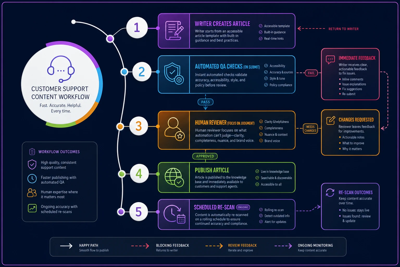
The sequence that actually works in practice:
-
Writer starts from the accessible template — structure, image blocks, and transcript fields already in place.
-
Writer drafts normally. The image block prompts for alt text as each screenshot is inserted, while the context is still fresh.
-
On "submit for review," automated QA runs. Blocking issues come back immediately with the specific location and fix ("Image 3 has no alt text"; "Heading on line 42 skips from H2 to H4").
-
Human reviewer focuses only on judgment calls — is this alt text actually useful, does the transcript match — not on mechanical checks the system already handled.
-
Published articles get re-scanned on a rolling schedule, because images get swapped and headings get edited after publish and silently break things.
The key insight: catch the error while the writer still has context. Flagging a missing transcript three weeks later means someone has to re-watch the video. Flagging it at submit means they fix it in thirty seconds.
Remediating legacy articles without boiling the ocean
The new template fixes everything going forward. It does nothing for the 300 articles already live. And the instinct to "fix them all" is exactly how remediation projects die — someone commits to auditing the entire library, the estimate balloons, and it gets shelved indefinitely.
Don't fix everything. Fix what gets read, in order.
The prioritization that works pulls two signals together: traffic (which articles actually get viewed) and severity (how broken they are). An article nobody reads with one missing alt attribute is not the problem. A high-traffic how-to with no transcript, filename alt text on every step, and scrambled headings is.
A realistic remediation plan runs in waves:
-
Wave 1 — top 20 by traffic. These are the articles most people land on. Full manual pass: proper alt text, transcripts, heading cleanup. This is where most of your real accessibility impact lives, because impact follows traffic.
-
Wave 2 — blocking automated failures across the rest. Run the QA queries against the whole library and fix only the block-level issues (missing alt, media without transcripts, heading skips). This is mechanical and fast.
-
Wave 3 — the long tail. Articles with low traffic and warn-level issues. Fix opportunistically — whenever someone edits one for content reasons, they bring it up to standard as part of that edit. Don't spin up a separate project for these.
Tie remediation of low-value articles to edits you're already making for other reasons, so it stops being a standalone cost.
A real scenario
A SaaS company with a billing and onboarding help center — around 280 articles — got a VPAT request from a prospective enterprise customer and realized they couldn't answer it honestly. An initial scan flagged roughly 190 articles with at least one blocking issue, mostly filename alt text and a cluster of tutorial videos with no transcripts.
Instead of a full audit, they ran the three-wave approach. The top 24 articles by traffic — which accounted for the large majority of help center views — got a full manual pass in about two weeks. Blocking automated fixes across the rest took another week or so, mostly transcript generation and alt-text cleanup. The long tail got folded into normal editing.
The outcomes were tangible but not dramatic in isolation. They answered the procurement request with a credible conformance statement instead of a stall. Deflection on the reworked tutorial articles improved once transcripts made the video content indexable and readable. And the authoring template meant they stopped generating new inaccessible articles — new content came in clean, so the backlog stopped growing underneath them. The compounding part was that the problem stopped getting worse.
When this is worth doing — and when it isn't the priority yet
Do this now if your help center is public-facing, you sell to enterprise or public-sector buyers, or you're adding articles faster than anyone can review them. Volume plus exposure is exactly the combination where the template-plus-automation approach pays off, because manual review alone can't keep up.
This is lower priority if your knowledge base is small, internal-only, and rarely changing. A ten-article internal wiki doesn't need an automated QA pipeline — a single careful human pass covers it.
Be careful if you're tempted to lead with a massive one-time remediation project before fixing authoring. Teams that do this end up cleaning 300 articles and then generating 50 new broken ones over the next quarter, because the thing that creates the problem — the authoring process — never changed. Fix the template first. Remediate second. Doing it in the other order means paying for the same cleanup repeatedly.
The thing most teams miss
Accessibility in a knowledge base isn't a content-quality problem you solve by trying harder or caring more. Caring more produces a burst of well-intentioned alt text that fades the moment the next deadline hits.
It's a process problem — the output of what your template allows, what your QA blocks, and what your writers are prompted to decide while they still have context. Get the authoring defaults right and the automated checks honest, and accessible content becomes the natural byproduct of writing an article, not a separate chore anyone can skip. That's the whole game: not heroics on each article, but a workflow where producing an inaccessible one takes more effort than producing an accessible one.
That's the whole game: not heroics on each article, but a workflow where producing an inaccessible one takes more effort than producing an accessible one.
Ready to elevate your customer support?
Join 2,000+ support teams using Helpyly to reduce response times, automate workflows, and deliver outstanding customer experiences.